ASP.NET - Basic Controls
ASP.NET - Directives
ASP.NET - Server Side
ASP.NET - Database Access

ASP.NET - File Uploading
In this section, we will discuss the basic controls available in ASP.NET
Button Controls:
ASP .Net provides three types of button controls: buttons, link buttons and
image buttons. As the names suggest a button displays text within a
rectangular area, a link button displays text that looks like a
hyperlink. And an Image Button displays an image.
When a user clicks a button control, two events are raised Click and Command.
Basic syntax for button controls:
<asp:Button ID="Button1" runat="server"
            onclick="Button1_Click" Text="Click" />
|
Common Properties of the Button control:
| Property | Description |
|---|---|
| Text | The text displayed by the button. This is for button and link button controls only. |
| ImageUrl | For image button control only. The image to be displayed for the button. |
| AlternateText | For image button control only. The text to be displayed if the browser can't display the image. |
| CausesValidation | Determines whether page validation occurs when a user clicks the button. The default is true. |
| CommandName | A string value that's passed to the Command event when a user clicks the button. |
| CommandArgument | A string value that's passed to the Command event when a user clicks the button. |
| PostBackUrl | The URL of the page that should be requested when the user clicks the button. |
Text Boxes and Labels:
Text
box controls are typically used to accept input from the user. A text
box control can accept one or more lines to text depending upon the
setting of the TextMode attribute.
Label
controls provide an easy way to display text which can be changed from
one execution of a page to the next. If you want to display a text that
does not change, you use the literal text.
Basic syntax for text controls:
<asp:TextBox ID="txtstate" runat="server" ></asp:TextBox |
Common Properties of the Text Box and Labels:
| Property | Description |
|---|---|
| TextMode | Specifies the type of text box. SingleLine creates a standard text box, MultiLIne creates a text box that accepts more than one line of text and the Password causes the characters that are entered to be masked. The default is SingleLine. |
| Text | The text content of the text box |
| MaxLength | The maximum number of characters that can be entered into the text box. |
| Wrap | It determines whether or not text wraps automatically for multi-line text box; default is true. |
| ReadOnly | Determines whether the user can change the text in the box; default is false, i.e., the user can change the text. |
| Columns | The width of the text box in characters. The actual width is determined based on the font that's used for the text entry |
| Rows | The height of a multi-line text box in lines. The default value is 0, means a single line text box. |
The mostly used attribute for a label control is 'Text', which implies the text displayed on the label.
Check Boxes and Radio Buttons:
A
check box displays a single option that the user can either check or
uncheck and radio buttons present a group of options from which the user
can select just one option.
To
create a group of radio buttons, you specify the same name for the
GroupName attribute of each radio button in the group. If more than one
group is required in a single form specify a different group name for
each group.
If
you want a check box or radio button to be selected when it's initially
displayed, set its Checked attribute to true. If the Checked attribute
is set for more than one radio button in a group, then only the last one
will be selected.
Basic syntax for check box:
<asp:CheckBox ID= "chkoption" runat= "Server"> </asp:CheckBox> |
Basic syntax for radio button:
<asp:RadioButton ID= "rdboption" runat= "Server"> </asp: RadioButton> |
Common Properties of the Check Boxes and Radio Buttons:
| Property | Description |
|---|---|
| Text | The text displayed next to the check box or radio button. |
| Checked | Specifies whether it is selected or not, default is false. |
| GroupName | Name of the group the control belongs to. |
List Controls:
ASP.Net
provides the controls: drop-down list, list box, radio button list,
check box list and bulleted list. These control let a user choose from
one or more items from the list.
List
boxes and drop-down list contain one or more list items. These lists
could be loaded either by code or by the ListItem Collection Editor.
Basic syntax for list box control:
<asp:ListBox ID="ListBox1"
      runat="server"
      AutoPostBack="True"
      OnSelectedIndexChanged="ListBox1_SelectedIndexChanged">
</asp:ListBox>
|
Basic syntax for a drop-down list control:
<asp:DropDownList ID="DropDownList1"
     runat="server"
     AutoPostBack="True"
     OnSelectedIndexChanged="DropDownList1_SelectedIndexChanged">
</asp:DropDownList>
|
Common Properties of List box and Drop-down Lists:
| Property | Description |
|---|---|
| Items | The collection of ListItem objects that represents the items in the control. This property returns an object of type ListItemCollection. |
| Rows | Specifies the number of items displayed in the box. If actual list contains more rows than displayed then a scroll bar is added. |
| SelectedIndex | The index of the currently selected item. If more than one item is selected, then the index of the first selected item. If no item is selected, the value of this property is -1. |
| SelectedValue | The value of the currently selected item. If more than one item is selected, then the value of the first selected item. If no item is selected, the value of this property is an empty string(""). |
| SelectionMode | Indicates whether a list box allows single selections or multiple selections. |
Common Properties of each list item objects:
| Property | Description |
|---|---|
| Text | The text displayed for the item |
| Selected | Indicates whether the item is selected. |
| Value | A string value associated with the item. |
It is important to notes that:
- To work with the items in a drop-down list or list box, you use the Items property of the control. This property returns a ListItemCollection object which contains all the items of the list.
- The SelectedIndexChanged event is raised when the user selects a different item from a drop-down list or list box.
The List Item Collections:
The
ListItemCollection object is a collection of ListItem objects. Each
ListItem object represents one item in the list. Items in a
ListItemCollection are numbered from 0.
When
the items into a list box are loaded using strings like:
lstcolor.Items.Add("Blue") . then both the Text and Value properties of
the list item are set to the string value you specify. To set it
differently you must create a list item object and then add that item to
the collection.
The
ListItem Collection Editor is used to add item to a drop-down list or
list box. This is used to create a static list of items. To display the
Collection Editor select Edit item from the smart tag menu, or select
the control and then click the ellipsis button from the Item property in
the Properties window.
Common Properties of List Item Collection:
| Property | Description |
|---|---|
| Item(integer) | A ListItem object that represents the item at the specified index. |
| Count | The number of items in the collection. |
Common methods of List Item Collection:
| Methods | Description |
|---|---|
| Add(string) | Adds a new item to the end of the collection and assigns the string parameter to the Text property of the item. |
| Add(ListItem) | Adds a new item to the end of the collection. |
| Insert(integer, string) | Inserts an item at the specified index location in the collection, and assigns the string parameter to the Text property of the item. |
| Insert(integer, ListItem) | Inserts the item at the specified index location in the collection. |
| Remove(string) | Removes the item with the Text value same as the string. |
| Remove(ListItem) | Removes the specified item. |
| RemoveAt(integer) | Removes the item at the specified index as the integer. |
| Clear | Removes all the items of the collection. |
| FindByValue(string) | Returns the item whose Value is same as the string. |
| FindByValue(Text) | Returns the item whose Text is same as the string. |
Radio Button list and Check Box list
A
radio button list presents a list of mutually exclusive options. A
check box list presents a list of independent options. These controls
contain a collection of ListItem objects that could be referred to
through the Items property of the control.
Basic syntax for radio button list:
<asp:RadioButtonList ID="RadioButtonList1" runat="server" AutoPostBack="True" OnSelectedIndexChanged="RadioButtonList1_SelectedIndexChanged"> </asp:RadioButtonList> |
Basic syntax for check box list:
<asp:CheckBoxList ID="CheckBoxList1" runat="server" AutoPostBack="True" OnSelectedIndexChanged="CheckBoxList1_SelectedIndexChanged"> </asp:CheckBoxList> |
Common Properties of Check Box and Radio Button Lists:
| Property | Description |
|---|---|
| RepeatLayout | This attribute specifies whether the table tags or the normal html flow to use while formatting the list when it is rendered. The default is Table |
| RepeatDirection | It specifies the direction in which the controls to be repeated. The values available are Horizontal and Vertical. Default is Vertical |
| RepeatColumns | It specifies the number of columns to use when repeating the controls; default is 0. |
Bulleted lists and Numbered lists:
The
bulleted list control creates bulleted lists or numbered lists. These
controls contain a collection of ListItem objects that could be referred
to through the Items property of the control.
Basic syntax of a bulleted list:
<asp:BulletedList ID="BulletedList1" runat="server"> </asp:BulletedList> |
Common Properties of the Bulleted List:
| Property | Description |
|---|---|
| BulletStyle | This property specifies the style and looks of the bullets, or numbers. |
| RepeatDirection | It specifies the direction in which the controls to be repeated. The values available are Horizontal and Vertical. Default is Vertical |
| RepeatColumns | It specifies the number of columns to use when repeating the controls; default is 0. |
HyperLink Control:
The HyperLink control is like the HTML <a> element.
Basic syntax for a hyperlink control:
<asp:HyperLink ID="HyperLink1" runat="server"> HyperLink </asp:HyperLink> |
It has the following important properties:
| Property | Description |
|---|---|
| ImageUrl | Path of the image to be displayed by the control |
| NavigateUrl | Target link URL |
| Text | The text to be displayed as the link |
| Target | The window or frame which will load the linked page. |
Image Control:
The image control is used for displaying images on the web page, or some alternative text, if the image is not available.
Basic syntax for an image control:
<asp:Image ID="Image1" runat="server"> |
It has the following important properties:
| Property | Description |
|---|---|
| AlternateText | Alternate text to be displayed |
| ImageAlign | Alignment options for the control |
| ImageUrl | Path of the image to be displayed by the control |
ASP.NET - Directives
ASP.Net
directives are instructions to specify optional settings, such as
registering a custom control and page language. These settings describe
how the web forms (.aspx) or user controls (.ascx) pages are processed
by the .Net framework.
The syntax for declaring a directive is:
<%@ directive_name attribute=value [attribute=value] %> |
In
this section, we will just introduce the ASP.Net directives and we will
use most of these directives throughout the tutorials.
The Application Directive
The Application directive defines application-specific attributes. It is provided at the top of the global.aspx file.
The basic syntax for a sample Application directive is:
<%@ Application Language="C#" %> |
The attributes of the Application directive are:
| Attributes | Description |
|---|---|
| Inherits | the name of the class from which to inherit |
| Description | text description of the application. Parsers and compilers ignore this |
| Language | language used in code blocks |
The Assembly Directive
The
Assembly directive links an assembly to the page or the application at
parse time. This could appear either in the global.asax file for
application-wide linking or in the page file or a user control file for
linking to a page or user control.
The basic syntax for a sample Assembly directive is:
<%@ Assembly Name ="myassembly" %> |
The attributes of the Assembly directive are:
| Attributes | Description |
|---|---|
| Name | the name of the assembly to be linked |
| Src | the path to the source file to be linked and compiled dynamically |
The Control Directive
The Control directive is used with the user controls and appears in the user control (.ascx) files.
The basic syntax for a sample Control directive is:
<%@ Control Language="C#" EnableViewState="false" %> |
The attributes of the Control directive are:
| Attributes | Description |
|---|---|
| AutoEventWireup | the Boolean value that enables or disables automatic association of events to handlers |
| ClassName | file name for the control |
| Debug | the Boolean value that enables or disables compiling with debug symbols |
| Description | text description of the control page, ignored by compiler |
| EnableViewState | the Boolean value that indicates whether view state is maintained across page requests |
| Explicit | for VB language, tells the compiler to use Option Explicit mode |
| Inherits | the class from which the control page inherits |
| Language | language for code and script |
| Src | the filename for the code-behind class |
| Strict | for VB language, tells the compiler to use the Option Strict mode |
The Implements Directive
The
Implement directive indicates that the web page, master page or user
control page must implement the specified .Net framework interface.
The basic syntax for an Implements directive is:
<%@ Implements Interface="interface_name" %> |
The Import Directive
The
Import directive imports a namespace into a web page, user control pate
of application. If the Import directive is specified in the
global.asax, then it will apply to the entire application. If it is in a
page of user control page, then it would apply to that page or control.
The basic syntax for an Import directive is:
<%@ namespace="System.Drawing" %> |
The Master Directive
The Master directive specifies a page file as being the mater page.
The basic syntax for a sample MasterPage directive is:
<%@ MasterPage Language="C#"  AutoEventWireup="true"
    CodeFile="SiteMater.master.cs" Inherits="SiteMaster"  %>
|
The MasterType Directive
The MasterType directive assigns a class name to the Master property of a page, to make it strongly typed.
The basic syntax for a MasterType directive is:
<%@ MasterType attribute="value"[attribute="value" ...] %> |
The OutputCache Directive
The
OutputCache directive controls the output caching policies of a web
page or a user control. We will discuss this directive in details, in
data caching.
The basic syntax for a OutputCache directive is:
<%@ OutputCache Duration="15" VaryByParam="None" %> |
The Page Directive
The Page directive defines the attributes specific to the page file for the page parser and the compiler.
The basic syntax for a Page directive is:
<%@ Page Language="C#"  AutoEventWireup="true"
    CodeFile="Default.aspx.cs" Inherits="_Default"  Trace="true" %>
|
The attributes of the Page directive are:
| Attributes | Description |
|---|---|
| AutoEventWireup | the Boolean value that enables or disables Page events that are being automatically bound to methods; for example, Page_Load |
| Buffer | the Boolean value that enables or disables HTTP response buffering |
| ClassName | class name for the page |
| ClientTarget | the browser for which server controls should render content |
| CodeFile | name of the code behind file |
| Debug | the Boolean value that enables or disables compilation with debug symbols |
| Description | text description of the page, ignored by the parser |
| EnableSessionState | enables, disables or makes session state read-only |
| EnableViewState | the Boolean value that enables or disables view state across page requests |
| ErrorPage | URL for redirection if an unhandled page exception occurs |
| Inherits | the name of the code behind or other class |
| Language | programming language for code |
| Src | file name of the code behind class |
| Trace | enables or disables tracing |
| TraceMode | indicates how trace messages are to be displayed - sorted by time or category |
| Transaction | indicates if transactions are supported |
| ValidateRequest | the Boolean value that indicates whether all input data is validated against a hardcoded list of values |
The PreviousPageType Directive
The PreviousPageType directive assigns a class to a page, so that the page is strongly typed.
The basic syntax for a sample PreviousPagetype directive is:
<%@ PreviousPageType attribute="value"[attribute="value" ...] %> |
The Reference Directive
The Reference directive indicates that another page or user control should be compiled and linked to the current page.
The basic syntax for a sample Reference directive is:
<%@ Reference Page ="somepage.aspx" %> |
The Register Directive
The Register derivative is used for registering the custom server controls and user controls.
The basic syntax for a sample Register directive is:
<%@ Register Src="~/footer.ascx" TagName="footer"
    TagPrefix="Tfooter" %>
ASP.NET - Validation Controls
ASP.Net
validation controls validate the user input data to ensure that
useless, unauthenticated or contradictory data don.t get stored.
ASP.Net provides the following validation controls:
The BaseValidator Class:
The
validation control classes inherit from the BaseValidator class and
inherit its properties and methods. Therefore, it would help to take a
look at the properties and the methods of this base class, which are
common for all the validation controls:
The RequiredFieldValidator:
The
RequiredFieldValidator control ensures that the required field is not
empty. It is generally tied to a text box to force input into the text
box.
The syntax for the control:
The RangeValidator:
The RangeValidator control verifies that the input value falls within a predetermined range.
It has three specific properties:
The syntax for the control:
The CompareValidator:
The CompareValidator control compares a value in one control with a fixed value, or, a value in another control.
It has the following specific properties:
The basic syntax for the control:
The RegularExpressionValidator
The
RegularExpressionValidator allows validating the input text by matching
against a pattern against a regular expression. The regular expression
is set in the ValidationExpression property.
The following table summarizes the commonly used syntax constructs for regular expressions:
Apart from single character match, a class of characters could be specified that can be matched, called the metacharacters.
Quantifiers could be added to specify number of times a character could appear
The syntax for the control:
The CustomValidator:
The
CustomValidator control allows writing application specific custom
validation routines for both the client side and the server side
validation.
The
client side validation is accomplished through the
ClientValidationFunction property. The client side validation routine
should be written in a scripting language, like JavaScript or VBScript,
which the browser can understand.
The
server side validation routine must be called from the control.s
ServerValidate event handler. The server side validation routine should
be written in any .Net language, like C# or VB.Net.
The basic syntax for the control
The ValidationSummary Control
The
ValidationSummary control does not perform any validation but shows a
summary of all errors in the page. The summary displays the values of
the ErrorMessage property of all validation controls that failed
validation.
The following two mutually inclusive properties list out the error message:
The syntax for the control:
Validation Groups:
Complex
pages have different groups of information provided in different
panels. In such a situation a need for performing validation separately
for separate group, might arise. This kind of situation is handled using
validation groups.
To
create a validation group, you should put the input controls and the
validation controls into the same logical group by setting their ValidationGroup property.
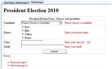
Example:
The
following example describes a form to be filled up by all the students
of a school, divided into four houses, for electing the school
president. We will be using the validation controls to validate the user
input.
The form in Design view:
The content file code:
The code behind the submit button:
|
We
have studied the page life cycle and how a page contains various
controls. The page itself is instantiated as a control object. All web
forms are basically instances of the ASP.Net Page class. The page class
has the following extremely useful properties that correspond to
intrinsic objects like:
- Session.
- Application
- Cache
- Request
- Response
- Server
- User
- Trace
We
will discuss each of these objects in due time. In this tutorial we
will explore the Server object, the Request object and the Response
object.
The Server Object:
The
Server object in Asp.Net is an instance of the
System.Web.HttpServerUtility class. The HttpServerUtility class provides
numerous properties and methods to perform various jobs.
Properties and Methods of the Server object:
The methods and properties of the HttpServerUtility class are exposed through the intrinsic Server object provided by ASP.NET.
The following table provides a list of the properties:
| Property | Description |
|---|---|
| MachineName | Name of server's computer |
| ScriptTimeOut | Gets and sets the request time-out value in seconds. |
The following table provides a list of some important methods:
| Method | Description |
|---|---|
| CreateObject(String) | Creates an instance of the COM object identified by its ProgID (Programmatic ID) |
| CreateObject(Type) | Creates an instance of the COM object identified by its Type |
| Equals(Object) | Determines whether the specified Object is equal to the current Object |
| Execute(String) | Executes the handler for the specified virtual path in the context of the current request. |
| Execute(String, Boolean) | Executes the handler for the specified virtual path in the context of the current request and specifies whether to clear the QueryString and Form collections |
| GetLastError | Returns the previous exception. |
| GetType | Gets the Type of the current instance. |
| HtmlEncode | Changes an ordinary string into a string with legal HTML characters. |
| HtmlDecode | Converts an Html string into an ordinary string |
| ToString | Returns a String that represents the current Object |
| Transfer(String) | For the current request, terminates execution of the current page and starts execution of a new page by using the specified URL path of the page. |
| UrlDecode | Converts an URL string into an ordinary string |
| UrlEncodeToken | Works same as UrlEncode, but on a byte array that contains Base64-encoded data |
| UrlDecodeToken | Works same as UrlDecode, but on a byte array that contains Base64-encoded data |
| MapPath | Return the physical path that corresponds to a specified virtual file path on the server |
| Transfer | Transfers execution to another web page in the current application |
The Request Object:
The
request object is an instance of the System.Web.HttpRequest class. It
represents the values and properties of the HTTP request that makes the
page loading into the browser.
The
information presented by this object is wrapped up by the higher level
abstractions (the web control model), however, this object helps in
checking some information like the client browser and cookies.
Properties and Methods of the Request Object:
The following table provides some noteworthy properties of the Request object:
| Property | Description |
|---|---|
| AcceptTypes | Gets a string array of client-supported MIME accept types. |
| ApplicationPath | Gets the ASP.NET application's virtual application root path on the server. |
| Browser | Gets or sets information about the requesting client's browser capabilities. |
| ContentEncoding | Gets or sets the character set of the entity-body. |
| ContentLength | Specifies the length, in bytes, of content sent by the client. |
| ContentType | Gets or sets the MIME content type of the incoming request. |
| Cookies | Gets a collection of cookies sent by the client. |
| FilePath | Gets the virtual path of the current request. |
| Files | Gets the collection of files uploaded by the client, in multipart MIME format. |
| Form | Gets a collection of form variables. |
| Headers | Gets a collection of HTTP headers. |
| HttpMethod | Gets the HTTP data transfer method (such as GET, POST, or HEAD) used by the client. |
| InputStream | Gets the contents of the incoming HTTP entity body. |
| IsSecureConnection | Gets a value indicating whether the HTTP connection uses secure sockets (that is, HTTPS). |
| QueryString | Gets the collection of HTTP query string variables. |
| RawUrl | Gets the raw URL of the current request. |
| RequestType | Gets or sets the HTTP data transfer method (GET or POST) used by the client. |
| ServerVariables | Gets a collection of Web server variables. |
| TotalBytes | Gets the number of bytes in the current input stream. |
| Url | Gets information about the URL of the current request. |
| UrlReferrer | Gets information about the URL of the client's previous request that linked to the current URL. |
| UserAgent | Gets the raw user agent string of the client browser. |
| UserHostAddress | Gets the IP host address of the remote client. |
| UserHostName | Gets the DNS name of the remote client. |
| UserLanguages | Gets a sorted string array of client language preferences. |
The following table provides a list of some important methods:
| Method | Description |
|---|---|
| BinaryRead | Performs a binary read of a specified number of bytes from the current input stream. |
| Equals(Object) | Determines whether the specified Object is equal to the current Object. (Inherited from Object.) |
| GetType | Gets the Type of the current instance. |
| MapImageCoordinates | Maps an incoming image-field form parameter to appropriate x-coordinate and y-coordinate values. |
| MapPath(String) | Maps the specified virtual path to a physical path. |
| SaveAs | Saves an HTTP request to disk. |
| ToString | Returns a String that represents the current Object |
| ValidateInput | Causes validation to occur for the collections accessed through the Cookies, Form, and QueryString properties. |
The Response Object:
The
Response object represents the server's response to the client request.
It is an instance of the System.Web.HttpResponse class.
In
ASP.Net, the Response object does not play a vital role in sending HTML
text to the client, because the server-side controls have nested,
object oriented methods for rendering themselves.
However,
the HttpResponse object still provides some important functionalities,
like the cookie feature and the Redirect() method. The
Response.Redirect() method allows transferring the user to another page,
inside as well as outside the application. It requires a round trip.
Properties and Methods of the Response Object:
The following table provides some noteworthy properties of the Response object:
| Property | Description |
|---|---|
| Buffer | Gets or sets a value indicating whether to buffer output and send it after the complete response is finished processing. |
| BufferOutput | Gets or sets a value indicating whether to buffer output and send it after the complete page is finished processing. |
| Charset | Gets or sets the HTTP character set of the output stream. |
| ContentEncoding | Gets or sets the HTTP character set of the output stream. |
| ContentType | Gets or sets the HTTP MIME type of the output stream. |
| Cookies | Gets the response cookie collection. |
| Expires | Gets or sets the number of minutes before a page cached on a browser expires. |
| ExpiresAbsolute | Gets or sets the absolute date and time at which to remove cached information from the cache |
| HeaderEncoding | Gets or sets an Encoding object that represents the encoding for the current header output stream. |
| Headers | Gets the collection of response headers. |
| IsClientConnected | Gets a value indicating whether the client is still connected to the server. |
| Output | Enables output of text to the outgoing HTTP response stream. |
| OutputStream | Enables binary output to the outgoing HTTP content body. |
| RedirectLocation | Gets or sets the value of the Http Location header. |
| Status | Sets the Status line that is returned to the client. |
| StatusCode | Gets or sets the HTTP status code of the output returned to the client. |
| StatusDescription | Gets or sets the HTTP status string of the output returned to the client. |
| SubStatusCode | Gets or sets a value qualifying the status code of the response. |
| SuppressContent | Gets or sets a value indicating whether to send HTTP content to the client. |
The following table provides a list of some important methods:
| Method | Description |
|---|---|
| AddHeader | Adds an HTTP header to the output stream. AddHeader is provided for compatibility with earlier versions of ASP. |
| AppendCookie | Infrastructure. Adds an HTTP cookie to the intrinsic cookie collection. |
| AppendHeader | Adds an HTTP header to the output stream. |
| AppendToLog | Adds custom log information to the Internet Information Services (IIS) log file. |
| BinaryWrite | Writes a string of binary characters to the HTTP output stream. |
| ClearContent | Clears all content output from the buffer stream. |
| Close | Closes the socket connection to a client. |
| End | Sends all currently buffered output to the client, stops execution of the page, and raises the EndRequest event. |
| Equals(Object) | Determines whether the specified Object is equal to the current Object |
| Flush | Sends all currently buffered output to the client. |
| GetType | Gets the Type of the current instance. |
| Pics | Appends a HTTP PICS-Label header to the output stream. |
| Redirect(String) | Redirects a request to a new URL and specifies the new URL. |
| Redirect(String, Boolean) | Redirects a client to a new URL. Specifies the new URL and whether execution of the current page should terminate. |
| SetCookie | Updates an existing cookie in the cookie collection. |
| ToString | Returns a String that represents the current Object. |
| TransmitFile(String) | Writes the specified file directly to an HTTP response output stream, without buffering it in memory. |
| Write(Char) | Writes a character to an HTTP response output stream. |
| Write(Object) | Writes an Object to an HTTP response stream. |
| Write(String) | Writes a string to an HTTP response output stream. |
| WriteFile(String) | Writes the contents of the specified file directly to an HTTP response output stream as a file block. |
| WriteFile(String, Boolean) | Writes the contents of the specified file directly to an HTTP response output stream as a memory block. |
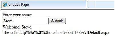
Example:
The
following simple example has a text box control where the user can
enter name, a button to send the information to the server and a label
control to display the URL of the client computer.
The content file:
<%@ Page Language="C#" AutoEventWireup="true"
                       CodeBehind="Default.aspx.cs"
                       Inherits="server_side._Default" %>

<!DOCTYPE html PUBLIC "-//W3C//DTD XHTML 1.0 Transitional//EN"
     "http://www.w3.org/TR/xhtml1/DTD/xhtml1-transitional.dtd">

<html xmlns="http://www.w3.org/1999/xhtml" >
<head runat="server">
    <title>Untitled Page</title>
</head>
<body>
    <form id="form1" runat="server">
    <div>
    Enter your name:<br />
        <asp:TextBox ID="TextBox1" runat="server"></asp:TextBox>
        <asp:Button ID="Button1" runat="server"
                    OnClick="Button1_Click" Text="Submit" />
        <br />
        <asp:Label ID="Label1" runat="server"/>

    </div>
    </form>
</body>
</html>
|
The code behind for Button1_Click:
protected void Button1_Click(object sender, EventArgs e)
{
   if (!String.IsNullOrEmpty(TextBox1.Text))
   {
       // Access the HttpServerUtility methods through
       // the intrinsic Server object.
       Label1.Text = "Welcome, " +
       Server.HtmlEncode(TextBox1.Text) +
       ".<br/> The url is " +
       Server.UrlEncode(Request.Url.ToString());
    }

 }
|
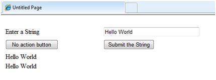
Run the page to see the following result
ASP.Net allows the following sources of data to be accessed and used:
- Databases (e.g., Access, SQL Server, Oracle, MySQL)
- XML documents
- Business Objects
- Flat files
ASP.Net
hides the complex processes of data access and provides much higher
level of classes and objects through which data is accessed easily.
These classes hide all complex coding for connection, data retrieving,
data querying and data manipulation.
ADO.Net
is the technology that provides the bridge between various ASP.Net
control objects and the backend data source. We will come to ADO.Net in
due time. In this tutorial, we will look at data access and working with
the data without going into the details of its inner workings.
Retrieve and display data:
It takes two types of data controls to retrieve and display data in ASP.Net:
- A data source control . it manages the connection to the data, selection of data and other jobs like paging and caching of data etc.
- A data view control . it binds and displays the data and allows data manipulation.
We
will discuss the data binding and data source controls in details
later. In this section, we will use a SqlDataSource control to access
data and a GridView control to display and manipulate data.
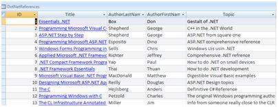
We
will also use an Access database, which has details about .Net books
available in the market. Name of our database is ASPDotNetStepByStep.mdb
and we will use the data table DotNetReferences.
The table has the following columns: ID, Title, AuthorFirstName, AuthorLastName, Topic, and Publisher.
Here is a snapshot of the data table:
Let us directly move to action, take the following steps:
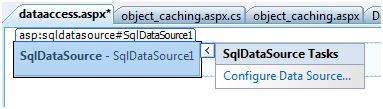
(1) Create a web site and add a SqlDataSourceControl on the web form.
(2) Click on the Configure Data Source Link.
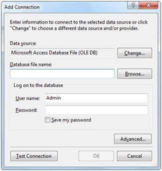
(3) Click on the New Connection button to establish connection with a database.
(4) Once
the connection is set up, you may save it for further use. At the next
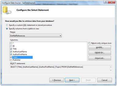
step, you are asked to configure the select statement:
(5) Select
the columns and click next to complete the steps. Observe the WHERE,
ORDER BY, AND the Advanced. Buttons. These buttons allow you to provide
the where clause, order by clause and specify the insert, update and
delete commands of SQL respectively. This way, you can manipulate the
data.
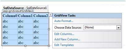
(6) Add a GridView control on the form. Choose the data source and format the control using AutoFormat option.
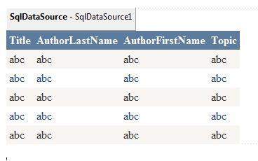
(7) After this the formatted GridView control displays the column headings, and the application is ready to run.
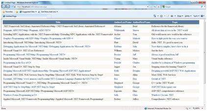
(8) Finally Run the application
The content file code:
<%@ Page Language="C#"
         AutoEventWireup="true"
         CodeBehind="dataaccess.aspx.cs"
         Inherits="datacaching.WebForm1" %>

<!DOCTYPE html PUBLIC "-//W3C//DTD XHTML 1.0 Transitional//EN"
     "http://www.w3.org/TR/xhtml1/DTD/xhtml1-transitional.dtd">

<html xmlns="http://www.w3.org/1999/xhtml" >
<head runat="server">
<title>Untitled Page</title>
</head>
<body>
<form id="form1" runat="server">
<div>
<asp:SqlDataSource ID="SqlDataSource1"
   runat="server"
   ConnectionString=
   "<%$ ConnectionStrings:ASPDotNetStepByStepConnectionString%>"
   ProviderName=
   "<%$ ConnectionStrings:
        ASPDotNetStepByStepConnectionString.ProviderName %>"
   SelectCommand="SELECT [Title], [AuthorLastName],
                         [AuthorFirstName], [Topic]
                  FROM [DotNetReferences]">
</asp:SqlDataSource>
<asp:GridView ID="GridView1"
   runat="server"
   AutoGenerateColumns="False"
   CellPadding="4"
   DataSourceID="SqlDataSource1"
   ForeColor="#333333"
   GridLines="None">
<RowStyle BackColor="#F7F6F3" ForeColor="#333333" />
<Columns>
<asp:BoundField DataField="Title" HeaderText="Title"
SortExpression="Title" />
<asp:BoundField DataField="AuthorLastName"
HeaderText="AuthorLastName"
SortExpression="AuthorLastName" />
<asp:BoundField DataField="AuthorFirstName"
HeaderText="AuthorFirstName"
SortExpression="AuthorFirstName" />
<asp:BoundField DataField="Topic"
HeaderText="Topic" SortExpression="Topic" />
</Columns>
<FooterStyle BackColor="#5D7B9D"
Font-Bold="True" ForeColor="White" />
<PagerStyle BackColor="#284775"
ForeColor="White" HorizontalAlign="Center" />
<SelectedRowStyle BackColor="#E2DED6"
Font-Bold="True" ForeColor="#333333" />
<HeaderStyle BackColor="#5D7B9D" Font-Bold="True"
ForeColor="White" />
<EditRowStyle BackColor="#999999" />
<AlternatingRowStyle BackColor="White" ForeColor="#284775" />
</asp:GridView>
</div>
</form>
</body>
</html>
|
ASP.NET - File Uploading
ASP.Net
has two controls that allow the users to upload files to the web
server. Once the server receives the posted file data, the application
can save it, check it or ignore it. The following controls allow the
file uploading:
- HtmlInputFile - an HTML server control
- FileUpload - and ASP.Net web control
Both
the controls allow file uploading, but the FileUpload control
automatically sets the encoding of the form, whereas the HtmlInputFile
does not do so.
In
this tutorial, we will use the FileUpload control. The FileUpload
control allows the user to browse for and select the file to be
uploaded, providing a Browse button and a text box for entering the
filename.
Once,
the user has entered the filename in the text box, by typing the name
or browsing, the SaveAs method of the FileUpload control can be called
to save the file to the disk.
The basic syntax for using the FileUpload is:
<asp:FileUpload ID= "Uploader" runat = "server" /> |
The
FileUpload class is derived from the WebControl class, and inherits all
its members. Apart from those, the FileUpload class has the following
read-only properties:
| Properties | Description |
|---|---|
| FileBytes | Returns an array of the bytes in a file to be uploaded.. |
| FileContent | Returns the stream object pointing to the file to be uploaded. |
| FileName | Returns the name of the file to be uploaded. |
| HasFile | Specifies whether the control has a file to upload. |
| PostedFile | Returns a reference to the uploaded file. |
The
posted file is encapsulated in an object of type HttpPostedFile, which
could be accessed through the PostedFile property of the FileUpload
class.
The HttpPostedFile class has the following important properties, which are much used:
| Properties | Description |
|---|---|
| ContentLength | Returns the size of the uploaded file in bytes. |
| ContentType | Returns the MIME type of the uploaded file |
| FileName | Returns the full filename. |
| InputStream | Returns a stream object pointing to the uploaded file. |
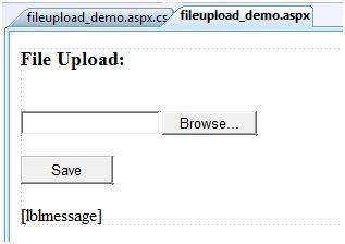
Example:
The
following example demonstrates the FileUpload control and its
properties. The form has a FileUpload control along with a save button
and a label control for displaying the file name, file type and file
length.
In the design view, the form looks like:
The content file:
<body>
<form id="form1" runat="server">
<div>
<h3> File Upload:</h3>
<br />
   <asp:FileUpload ID="FileUpload1" runat="server" />
   <br /><br />
   <asp:Button ID="btnsave" runat="server"
               onclick="btnsave_Click" Text="Save"
               Width="85px" />
   <br /><br />
   <asp:Label ID="lblmessage" runat="server" />
</div>
</form>
</body>
|
The code behind the save button:
protected void btnsave_Click(object sender, EventArgs e)
{
   StringBuilder sb = new StringBuilder();
   if (FileUpload1.HasFile)
   {
      try
      {
      sb.AppendFormat(" Uploading file: {0}",
                                  FileUpload1.FileName);
      //saving the file
      FileUpload1.SaveAs("<c:\\SaveDirectory>" +
                                  FileUpload1.FileName);
      //Showing the file information
      sb.AppendFormat("<br/> Save As: {0}",
                         FileUpload1.PostedFile.FileName);
      sb.AppendFormat("<br/> File type: {0}",
                         FileUpload1.PostedFile.ContentType);
      sb.AppendFormat("<br/> File length: {0}",
                         FileUpload1.PostedFile.ContentLength);
      sb.AppendFormat("<br/> File name: {0}",
                         FileUpload1.PostedFile.FileName);
      }
      catch (Exception ex)
      {
      sb.Append("<br/> Error <br/>");
      sb.AppendFormat("Unable to save file <br/> {0}",
                         ex.Message);
      }
   }
   else
   {
      lblmessage.Text = sb.ToString();
   }
}
|
Note the following:
- The StringBuilder class is derived from System.IO namespace, so it should be included.
- The try and catch blocks are used for catching errors, and display the error message.
The
AdRotator control randomly selects banner graphics from a list, which
is specified in an external XML schedule file. This external XML
schedule file is called the advertisement file.
The
AdRotator control allows you to specify the advertisement file and the
type of window that the link should follow in AdvertisementFile and
Target property respectively.
The basic syntax of adding an AdRotator is as follows:
<asp:AdRotator  runat = "server"
                AdvertisementFile = "adfile.xml"
                Target = "_blank" />
|
Before
going into details of the AdRotator control and its properties, let us
look into the construction of the advertisement file.
The Advertisement File:
The advertisement file is an XML file, which contains the information about the advertisements to be displayed.
Extensible
Markup Language (XML) is a W3C standard for text document markup. It is
a text-based markup language that enables you to store data in a
structured format by using meaningful tags. The term 'extensible'
implies that you can extend you ability to describe a document by
defining meaningful tags for your application.
XML
is not a language in itself, like HTML but, a set of rules for creating
new markup languages. It is a meta-markup language. It allows
developers to create custom tag sets for special uses. It structures,
stores and transport information.
Following is an example of XML file:
<BOOK> <NAME> Learn XML </NAME> <AUTHOR> Samuel Peterson </AUTHOR> <PUBLISHER> NSS Publications </PUBLISHER> <PRICE> $30.00</PRICE> </BOOK> |
Like
all XML files, the advertisement file needs to be a structured text
file with well-defined tags delineating the data. There are the
following standard XML elements that are commonly used in the
advertisement file:
| Element | Description |
|---|---|
| Advertisements | Encloses the advertisement file |
| Ad | Delineates separate ad |
| ImageUrl | The image that will be displayed |
| NavigateUrl | The link that will be followed when the user clicks the ad |
| AlternateText | The text that will be displayed instead of the picture if it cannot be displayed |
| Keyword | Keyword identifying a group of advertisements. This is used for filtering |
| Impressions | The number indicating how often an advertisement will appear |
| Height | Height of the image to be displayed |
| Width | Width of the image to be displayed |
Apart
from these tags, customs tags with custom attributes could also be
included. The following code illustrates an advertisement file ads.xml:
<Advertisements> <Ad> <ImageUrl>rose1.jpg</ImageUrl> <NavigateUrl>http://www.1800flowers.com</NavigateUrl> <AlternateText> Order flowers, roses, gifts and more </AlternateText> <Impressions>20</Impressions> <Keyword>flowers</Keyword> </Ad> <Ad> <ImageUrl>rose2.jpg</ImageUrl> <NavigateUrl>http://www.babybouquets.com.au</NavigateUrl> <AlternateText>Order roses and flowers</AlternateText> <Impressions>20</Impressions> <Keyword>gifts</Keyword> </Ad> <Ad> <ImageUrl>rose3.jpg</ImageUrl> <NavigateUrl>http://www.flowers2moscow.com</NavigateUrl> <AlternateText>Send flowers to Russia</AlternateText> <Impressions>20</Impressions> <Keyword>russia</Keyword> </Ad> <Ad> <ImageUrl>rose4.jpg</ImageUrl> <NavigateUrl>http://www.edibleblooms.com</NavigateUrl> <AlternateText>Edible Blooms</AlternateText> <Impressions>20</Impressions> <Keyword>gifts</Keyword> </Ad> </Advertisements> |
Properties and events of the AdRotator Class:
The
AdRotator class is derived from the WebControl class and inherits its
properties. Apart from those the AdRotator class has the following
properties:
| Properties | Description |
|---|---|
| AdvertisementFile | The path to the advertisement file. |
| AlternateTextFeild | The element name of the field where alternate text is provided; default value is AlternateText. |
| DataMember | The name of the specific list of data to be bound when advertisement file is not used. |
| DataSource | Control from where it would retrieve data. |
| DataSourceID | Id of the control from where it would retrieve data. |
| Font | Specifies the font properties associated with the advertisement banner control. |
| ImageUrlField | The element name of the field where the URL for the image is provided; default value is ImageUrl. |
| KeywordFilter | For displaying the keyword based ads only. |
| NavigateUrlField | The element name of the field where the URL to navigate to is provided; default value is NavigateUrl. |
| Target | The browser window or frame that displays the content of the page linked. |
| UniqueID | Obtains the unique, hierarchically qualified identifier for the AdRotator control. |
Following are the important events of the AdRotator Class:
| Events | Description |
|---|---|
| AdCreated | It is raised once per round trip to the server after creation of the control, but before the page is rendered |
| DataBinding | Occurs when the server control binds to a data source. |
| DataBound | Occurs after the server control binds to a data source. |
| Disposed | Occurs when a server control is released from memory, which is the last stage of the server control lifecycle when an ASP.NET page is requested |
| Init | Occurs when the server control is initialized, which is the first step in its lifecycle. |
| Load | Occurs when the server control is loaded into the Page object. |
| PreRender | Occurs after the Control object is loaded but prior to rendering. |
| Unload | Occurs when the server control is unloaded from memory. |
Working with the AdRotator Control
Create a new web page and place an AdRotator control on it.
<form id="form1" runat="server">
<div>
   <asp:AdRotator ID="AdRotator1"
                runat="server" AdvertisementFile ="~/ads.xml"
                onadcreated="AdRotator1_AdCreated" />

</div>
</form>
|
The ads.xml file and the image files should be located in the root directory of the web site.
Try to run the above application an dobserve that each time the page is reloaded, the ad is changed.
ASP.NET - Calendars
ASP.NET - Calendars
The calendar control is a functionally rich web control, which provides the following capabilities:
- Displaying one month at a time
- Selecting a day, a week or a month
- Selecting a range of days
- Moving from month to month
- Controlling the display of the days programmatically
The basic syntax for adding a calendar control is:
<asp:Calender ID = "Calendar1" runat = "server"></asp:Calender> |
Properties and Events of the Calendar Control
The
calendar control has many properties and events, using which you can
customize the actions and display of the control. The following table
provides some important properties of the Calendar control:
| Properties | Description |
|---|---|
| Caption | Gets or sets the caption for the calendar control. |
| CaptionAlign | Gets or sets the alignment for the caption. |
| CellPadding | Gets or sets the number of space between the data and the cell.s border. |
| CellSpacing | Gets or sets the space between cells. |
| DayHeaderStyle | Gets the style properties for the section that displays the day of the week. |
| DayNameFormat | Gets or sets format of days of the week. |
| DayStyle | Gets the style properties for the days in the displayed month. |
| FirstDayOfWeek | Gets or sets the day of week to display in the first column. |
| NextMonthText | Gets or sets the text for next month navigation control; default value is > |
| NextPrevFormat | Gets or sets the format of the next and previous month navigation control. |
| OtherMonthDayStyle | Gets the style properties for the days on the Calendar control that are not in the displayed month. |
| PrevMonthText | Gets or sets the text for previous month navigation control; default value is < |
| SelectedDate | Gets or sets the selected date. |
| SelectedDates | Gets a collection of DateTime objects representing the selected dates. |
| SelectedDayStyle | Gets the style properties for the selected dates. |
| SelectionMode | Gets or sets the selection mode that specifies whether the user can select a single day, a week or an entire month. |
| SelectMonthText | Gets or sets the text for the month selection element in the selector column. |
| SelectorStyle | Gets the style properties for the week and month selector column. |
| SelectWeekText | Gets or sets the text displayed for the week selection element in the selector column. |
| ShowDayHeader | Gets or sets the value indicating whether the heading for the days of the week is displayed. |
| ShowGridLines | Gets or sets the value indicating whether the gridlines would be shown. |
| ShowNextPrevMonth | Gets or sets a value indicating whether next and previous month navigation elements are shown in the title section. |
| ShowTitle | Gets or sets a value indicating whether the title section is displayed. |
| TitleFormat | Gets or sets the format for the title section. |
| Titlestyle | Get the style properties of the title heading for the Calendar control. |
| TodayDayStyle | Gets the style properties for today's date on the Calendar control. |
| TodaysDate | Gets or sets the value for today.s date. |
| UseAccessibleHeader | Gets or sets a value that indicates whether to render the table header <th> HTML element for the day headers instead of the table data <td> HTML element. |
| VisibleDate | Gets or sets the date that specifies the month to display. |
| WeekendDayStyle | Gets the style properties for the weekend dates on the Calendar control. |
The
Calendar control has the following three most important events that
allow the developers to program the calendar control. These are:
| Events | Description |
|---|---|
| SelectionChanged | It is raised when a day, a week or an entire month is selected |
| DayRender | It is raised when each data cell of the calendar control is rendered. |
| VisibleMonthChanged | It is raised when user changes a month |
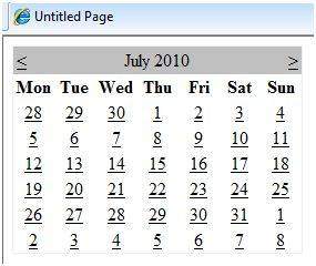
Working with the Calendar Control
Putting
a bare-bone calendar control without any code behind file provides a
workable calendar to a site, which shows the month and days of the year.
It also allows navigating to next and previous months.
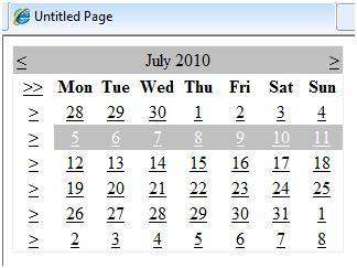
Calendar
controls allow the users to select a single day, a week or an entire
month. This is done by using the SelectionMode property. This property
has the following values:
| Properties | Description |
|---|---|
| Day | To select a single day |
| DayWeek | To select a single day or an entire week |
| DayWeekMonth | To select a single day, a week or an entire month |
| None | Nothing can be selected |
The syntax for selecting days:
<asp:Calender ID = "Calendar1"
                 runat = "server"
                 SelectionMode="DayWeekMonth">
</asp:Calender>
|
When
the selection mode is set to the value DayWeekMonth, an extra column
with the > symbol appears for selecting the week and a >>
symbol appears to the left of the days' name for selecting the month.
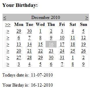
Example:
The following example demonstrates selecting a date and displays the date in a label:
The content file:
<%@ Page Language="C#"
         AutoEventWireup="true"
         CodeBehind="Default.aspx.cs"
         Inherits="calendardemo._Default" %>

<!DOCTYPE html PUBLIC "-//W3C//DTD XHTML 1.0 Transitional//EN"
    "http://www.w3.org/TR/xhtml1/DTD/xhtml1-transitional.dtd">

<html xmlns="http://www.w3.org/1999/xhtml" >
<head runat="server">
    <title>Untitled Page</title>
</head>
<body>
    <form id="form1" runat="server">
    <div>
    <h3> Your Birthday:</h3>
        <asp:Calendar ID="Calendar1"
             runat="server"
             SelectionMode="DayWeekMonth"
             onselectionchanged="Calendar1_SelectionChanged">
        </asp:Calendar>
    </div>
    <p>Todays date is:
        <asp:Label ID="lblday" runat="server"></asp:Label>
    </p>
    <p>Your Birday is:
        <asp:Label ID="lblbday" runat="server"></asp:Label>
    </p>
    </form>
</body>
</html>
|
The event handler for the event SelectionChanged:
protected void Calendar1_SelectionChanged(object sender,
                                          EventArgs e)
{
    lblday.Text = Calendar1.TodaysDate.ToShortDateString();
    lblbday.Text = Calendar1.SelectedDate.ToShortDateString();
}
|
When the file run should produce the following output: